
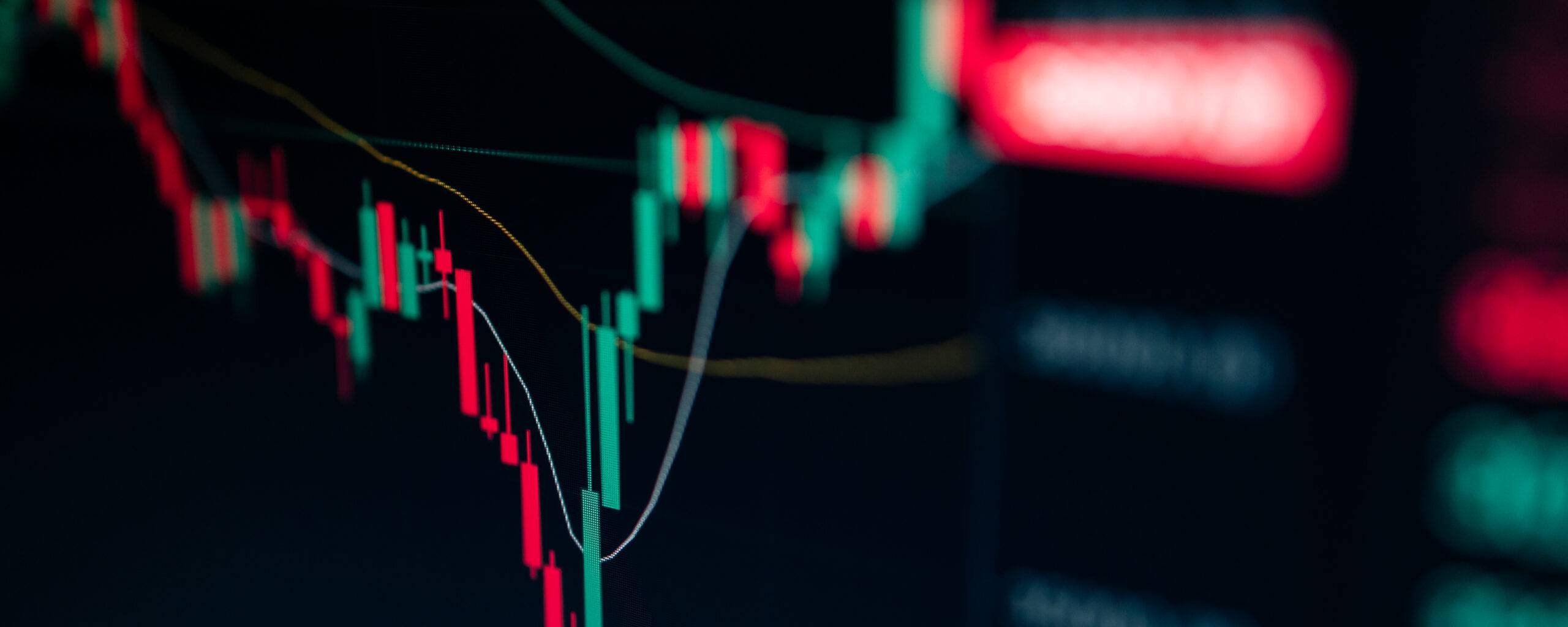
In the intricate landscape of financial markets, understanding candlestick charts is pivotal for informed trading and investment decisions. This visual and intuitive method, which has its roots in ancient Japan, has evolved to be an indispensable instrument for global traders. But what makes them so popular, and how do you read them? This article delves into the world of candlestick charts, breaking down their components, and how to use them to predict future price movements.

Understanding Candlestick Charts
Candlestick charts, rooted in ancient Japanese rice trading, provide a nuanced view of market price movements, offering a distinct edge over traditional line or bar charts. Each candlestick captures a wealth of information within a set timeframe, highlighting the opening, closing, highest, and lowest prices. The body of the candlestick, usually colored, represents the range between the opening and closing prices, with its hue indicating bullish or bearish activity. Meanwhile, the thin wicks detail the extremes, showcasing the highs and lows.

Source: dailyFX
This intricate visualization equips traders with deep insights into market sentiments and potential trend trajectories. By observing patterns formed by multiple candlesticks, traders can glean clues about future price shifts, enabling more strategic trading decisions.
Candlestick charts are not just about presenting data. They weave stories of market dynamics, volatility, and potential, serving as invaluable tools for traders to navigate the financial seas.
Understanding Price Action
Central to the realm of candlestick charting is the intricate dance of ‘price action’. Envision it as the vibrant chronicle of a market’s heartbeat, pulsating with every rise and fall of prices within a designated timeframe. Each rise and dip, every surge and retreat, conveys a story of market dynamics, driven by a multitude of factors ranging from macroeconomic events to investor sentiment.
The beauty of candlestick charts lies in their ability to visually translate this narrative. Each candle’s form, whether tall or short, filled or hollow, wick-laden or minimal, speaks of the struggles between buyers and sellers. Like a detailed map of a battlefield, the candles reveal skirmishes won and lost, highlighting areas of dominance and resistance. The varying shapes and patterns that emerge are more than mere coincidences; they’re manifestations of underlying buying and selling pressures. For instance, a long green (or white) candle indicates strong buying momentum, where buyers were willing to push the price higher, whereas a long red (or black) candle signals a dominant selling force.
For traders, comprehending these patterns is akin to understanding a secret language. By decrypting the tales told by consecutive candles, traders gain an edge. They can discern potential moments when the market might be on the cusp of a change, indicating an impending reversal, or when it’s steadfast in its current direction, signaling a continuation. Such insights are invaluable. In the tumultuous waters of financial markets, where uncertainty is the only certainty, the ability to predict potential market moves based on price action becomes a powerful compass, guiding traders toward more informed and strategic decisions.
The Anatomy of a Candle
Delving into the Candle’s Structure
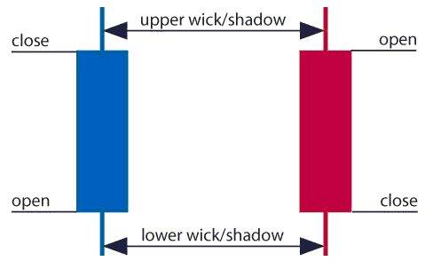
Every candlestick on a chart serves as a visual representation of market activity during a specific period, providing a wealth of information encapsulated in its structure. To decode the messages these candles convey, understanding their individual components is essential.
- Open Price: When a new timeframe begins – be it a minute, hour, day, or more – the first trade executed sets the open price. In a green or blue candle, this price is depicted at the bottom of the candle’s body, signifying the start of an upward journey. Conversely, in a red candle, the open price sits at the top, marking the onset of a downward trend.
- Close Price: This is the curtain call, the final transaction that occurred before the candle’s period ended. When this price is higher than the open, optimism reigns, represented by a green or blue hue. However, if the market sentiment was bearish, leading the close price to dip below the open, a red hue paints the candle, capturing the market’s descent.
- Wick/Shadow: These delicate extensions from the candle’s robust body narrate tales of volatility and extremes. They chronicle the highs and lows, the peaks of optimism, and the troughs of pessimism. While the upper wick stretches to the zenith of trading activity, showcasing the maximum price buyers were willing to pay, the lower wick plunges to the nadir, capturing the lowest point sellers were forced to concede.
- Body: Acting as the core of the candlestick, the body encapsulates the tug-of-war between buyers and sellers during the period. Its size and color are indicative of the market’s strength and direction. A large green or blue body speaks of dominant buying pressure, while a substantial red body echoes sellers’ dominance. Conversely, a small body, irrespective of color, suggests a period of indecision, where neither party could gain the upper hand.
Source: dailyFX
Every candlestick is like a battlefield, chronicling the ebbs and flows of market forces within its anatomy. By understanding these components, traders can gauge market sentiment, anticipate potential shifts, and strategize accordingly.

Interpreting Candle Patterns: Hammer Formation & Bullish Engulfing Pattern
Decoding the Messages in Candlestick Formations
Candlestick charting, an ancient Japanese method of technical analysis, uses specific patterns to predict future price movements. These patterns, formed by one or more candles, reveal the underlying market sentiments and potential shift in price dynamics. Among the vast repository of candlestick formations, two stand out for their reliability and frequency of occurrence:

Source: dailyFX
- Hammer Formation: At a first glance, the hammer bears resemblance to its namesake tool. Characterized by its petite body – either red or green/blue – and a significantly longer lower wick, this formation is a beacon of hope in a downtrending market. It tells a tale of a session where sellers initially had the upper hand, driving prices lower, but eventually, the buyers mounted a comeback, pushing prices close to where they started. The hammer, especially when accompanied by increased volume, is often viewed as a harbinger of a potential bullish reversal. Traders, upon identifying this formation, might strategize to capitalize on a possible upward price trajectory.
- Bullish Engulfing Pattern: This dramatic formation unfolds over two trading sessions. The opening act features a relatively small red candle, representing a continuation of the prevailing bearish sentiment. However, the sequel showcases a dominant green/blue candle, significantly larger in size, which ‘engulfs’ or overshadows the entirety of the previous red candle. It’s as if the market suddenly awakens, shaking off its prior lethargy. This abrupt shift often signals that the sellers have exhausted their momentum and the buyers are now in control, setting the stage for potential upward price movement. Seasoned traders, aware of the potency of the bullish engulfing pattern, often adjust their positions to ride the anticipated bullish wave.

Source: dailyFX
In the complex world of trading, these candlestick patterns offer a glimmer of clarity, enabling traders to make informed decisions. By understanding and recognizing these patterns, one can navigate the tumultuous seas of the market with greater confidence.
Trendlines and Classic Price Patterns
In the vibrant tapestry of technical analysis, trendlines and classic price patterns emerge as fundamental threads, weaving together the story of price movements and potential future directions.
- The Power of Trendlines: Acting as the market’s roadmap, trendlines trace the trajectory of bullish or bearish sentiments over time. By joining successive peaks (for downtrends) or troughs (for uptrends), these lines demarcate boundaries of price movements. The more often the price touches a trendline without breaking through, the stronger that trendline becomes. When prices do breach these lines, it often indicates a significant event – a potential shift in sentiment, a breakout or a breakdown. Observing these intersections, traders can gauge the momentum behind a particular move and anticipate possible reversals or continuations.
- Timeless Tales of Classic Price Patterns: Beyond trendlines, candlestick charts are frequently adorned with a myriad of price patterns – each echoing its own market folklore. Consider the triangular formations, which signal a consolidation phase before an inevitable breakout. The shape of the triangle, whether ascending, descending, or symmetrical, can offer hints about the direction of the forthcoming breakout. Then there’s the ‘head and shoulders’, a pattern signaling a reversal after a significant trend. Its inverse, the inverse head and shoulders, hints at a bullish reversal after a downtrend. And not to be overlooked are the double tops and bottoms – patterns that indicate a pause and potential reversal after a strong upward or downward movement.
When candlestick charting converges with trendlines and these enduring patterns, it crafts a comprehensive visual narrative. Traders who can decode this narrative stand a better chance of capitalizing on market opportunities, by pinpointing more precise entry, exit, and stop-loss points.
Practical Tips for Reading Candlestick Charts
Venturing into the intricate realm of candlestick charting can be likened to learning a new language; it’s nuanced, profound, and when understood correctly, immensely rewarding. As you delve deeper into this charting method, here are some essential tips and insights to aid your navigation:
- The Significance of Timeframes: The canvas on which the story of price movement unfolds is the timeframe. Whether you’re scrutinizing the ebb and flow of an hourly chart, the broader strokes of a weekly one, or the day-to-day intricacies of a daily chart, it’s crucial to select a timeframe that resonates with your trading approach and objectives. While shorter timeframes might cater to intraday traders seeking swift market moves, longer ones might be more suited for those with a more strategic, long-term perspective.
- Decoding Patterns – The Tapestry of Trends: One of the standout facets of candlestick charting is its rich array of patterns. Think of these as sentences or phrases in the language of trading, each conveying specific market sentiments and potential price directions. While the solo dance of a single candlestick can provide insights, the choreography of patterns formed over multiple periods paints a fuller picture. Dive into the depths of patterns like the ‘harami cross’, ‘morning star’, or ‘three black crows’. Each pattern, be it bullish or bearish, whispers clues about forthcoming price action, waiting for those keen enough to listen.
- Honoring the Sovereignty of Price Action: At the beating heart of candlestick charting is the doctrine of price action. It’s the pulse, the rhythm, the underlying tale of the battle between buyers and sellers. Every wick, shadow, and body is a testament to the market’s sentiment at any given moment. By honing the craft of reading these signs, traders can transcend mere speculation, achieving a more nuanced understanding of market dynamics. Remember, as with any skill, proficiency in reading price action stems from continuous practice, analysis, and a touch of intuition.
Conclusion
In conclusion, candlestick charts, with their visual richness and depth of information, have become an indispensable tool for traders worldwide. While mastering them requires practice and patience, the rewards in terms of actionable insights are well worth the effort. Happy trading!
Click here to read our latest article on Mastering Forex Trading Signals

FAQs
- What is the significance of Understanding Candlestick Charts for traders? Understanding candlestick charts is pivotal for informed trading and investment decisions. Originating in ancient Japan, these charts offer traders a nuanced view of market price movements and are vital in anticipating potential shifts in market sentiment.
- Why are candlestick charts more preferable than traditional line or bar charts? Candlestick charts capture a wealth of information within a set timeframe, including the opening, closing, highest, and lowest prices. They provide deep insights into market sentiments, allowing traders to glean clues about future price shifts, offering a distinct edge over traditional line or bar charts.
- What is ‘price action’ in the context of candlestick charting? Price action refers to the vibrant chronicle of a market’s movement, reflecting every rise and fall of prices within a designated timeframe. It captures the story of market dynamics influenced by factors like macroeconomic events and investor sentiment. Candlestick charts visually translate this narrative.
- How does the structure of an individual candlestick in a chart convey information? Every candlestick captures market activity for a specific period. It details the open price, close price, wicks/shadows, and the body. These components chronicle the ebbs and flows of market forces, allowing traders to gauge market sentiment and anticipate potential shifts.
- What insights can traders gain from patterns like the Hammer Formation or Bullish Engulfing Pattern? These patterns reveal underlying market sentiments and potential shifts in price dynamics. The Hammer Formation often indicates a potential bullish reversal, especially in a downtrending market. The Bullish Engulfing Pattern suggests the sellers might have exhausted their momentum and that buyers are gaining control, indicating potential upward price movement.
- How do trendlines play a role in candlestick chart analysis? Trendlines trace the trajectory of bullish or bearish sentiments over time, joining successive peaks or troughs. They act as boundaries of price movements, helping traders gauge the momentum behind a move and anticipate possible reversals or continuations.
- Why are classic price patterns like triangles and ‘head and shoulders’ significant for traders? Classic price patterns, woven into the tapestry of candlestick charts, signal potential future price movements. For example, triangular formations indicate consolidation before a breakout, while the ‘head and shoulders’ pattern signals a potential trend reversal.
- How do timeframes influence the interpretation of candlestick charts? The timeframe determines the granularity of price movement details. Traders should select a timeframe that aligns with their trading approach, be it short-term moves on an hourly chart or long-term strategies on weekly charts.
- Why is continuous practice crucial for mastering the art of reading price action? Proficiency in reading price action, the underlying tale of the battle between buyers and sellers, stems from continuous practice, analysis, and a touch of intuition. By honing this skill, traders can achieve a more nuanced understanding of market dynamics.
- What’s the key takeaway for traders regarding candlestick charts? Candlestick charts, with their visual richness, offer traders actionable insights into market sentiments and potential price movements. While mastering them requires diligence, the insights gained can significantly inform and improve trading strategies.
Click here to learn more about Candlestick Patterns